React is a popular JavaScript library for building user interfaces, and it provides a wide range of tools for creating interactive and responsive components. One of these tools is the react-select library, which provides a powerful and customizable multi-select dropdown component.
If you want to create multiple select dropdown in react js app. In this tutorial, you will learn how to use react-select to create a multi-select dropdown component in a React js application.
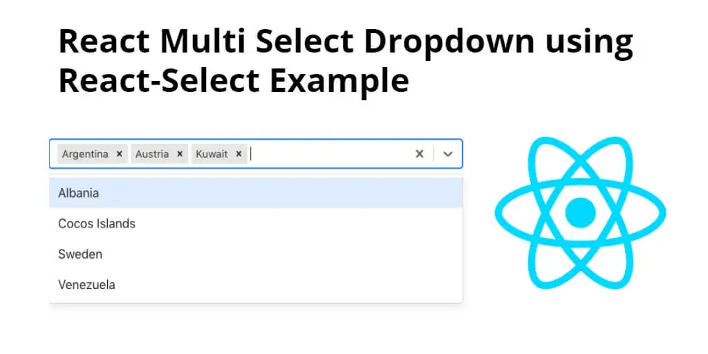
React Dropdown Multi Select Example using React-select
Just follow the following steps and how to create multi-select dropdown in react js app:
- Step 1 – Create New React App
- Step 2 – Install React-Select and Bootstrap
- Step 3 – Creating the Multi-Select Dropdown Component
- Step 4 – Using the Multi-Select Dropdown Component
Step 1 – Create New React App
In this step, open your terminal and execute the following command on your terminal to create a new react app:
npx create-react-app my-react-app
To run the React app, execute the following command on your terminal:
npm start
Check out your React app on this URL: localhost:3000
Step 2 – Install React-Select and Bootstrap
In this step, execute the following command to install select and bootstrap 4 libraries into your react app:
npm install bootstrap --save

npm install react-select
react-select is a powerful library that provides various methods and options to customize the behavior of the multi-select dropdown. Here are some of the main methods provided by the library:
onChange: This method is called whenever an option is selected or deselected in the dropdown. It receives the selected option(s) as its argument.onInputChange: This method is called whenever the user types in the input field of the dropdown. It receives the current input value as its argument.onMenuOpen: This method is called when the dropdown menu is opened.onMenuClose: This method is called when the dropdown menu is closed.getOptionLabel: This method is used to customize the label of each option in the dropdown. It receives the option object as its argument and should return the label to be displayed.getOptionValue: This method is used to customize the value of each option in the dropdown. It receives the option object as its argument and should return the value to be used.filterOption: This method is used to customize the filtering of options when the user types in the input field of the dropdown. It receives the option object and the current input value as its arguments and should return a boolean value indicating whether the option should be displayed.formatOptionLabel: This method is used to customize the appearance of each option in the dropdown. It receives the option object as its argument and should return a React component that represents the formatted option label.
By using these methods and other options provided by the library, you can create a highly customized and powerful multi-select dropdown in our React applications.
Add bootstrap.min.css file in src/App.js file:
import React, { Component } from 'react'

import '../node_modules/bootstrap/dist/css/bootstrap.min.css';

function App() {
  return (
    <div>
      <h2>How to Create Multi-Select Dropdown in React Example</h2>
    </div>
  );
}

export default App;
Step 3 – Creating the Multi-Select Dropdown Component
To create the multi-select dropdown component, we need to import the react-select library in our component file and use its Select component to render the dropdown.
First, let’s create a new file called MultiSelectDropdown.js in the src directory. In this file, we will define our component as follows:
import React, { useState } from 'react';
import Select from 'react-select';

const options = [
  { value: 'apple', label: 'Apple' },
  { value: 'banana', label: 'Banana' },
  { value: 'orange', label: 'Orange' },
  { value: 'pear', label: 'Pear' },
  { value: 'grape', label: 'Grape' },
];

const MultiSelectDropdown = () => {
  const [selectedOptions, setSelectedOptions] = useState([]);

  const handleMultiSelectChange = (selectedOptions) => {
    setSelectedOptions(selectedOptions);
  };

  return (
    <div>
      <Select
        options={options}
        isMulti
        onChange={handleMultiSelectChange}
        value={selectedOptions}
      />
    </div>
  );
};

export default MultiSelectDropdown;
In this component, you first import the useState hook from React and the Select component from the react-select library. You also define an array of options that will be displayed in the dropdown.
Next, to define our MultiSelectDropdown component. Inside this component, you use the useState hook to define a selectedOptions state variable and a setSelectedOptions function to update it.
Also define a handleMultiSelectChange function that will be called whenever the user selects or deselects an option in the dropdown. This function updates the selectedOptions state variable with the selected options.
Finally, you render the Select component with the options, isMulti, onChange, and value props. The isMulti prop specifies that the dropdown should allow multiple selections, the onChange prop specifies the function to be called when the user selects or deselects an option, and the value prop specifies the currently selected options.
Step 4 – Using the Multi-Select Dropdown Component
Now that you have created our MultiSelectDropdown component, we can use it in our React application.
In the App.js file, we can import the MultiSelectDropdown component and render it as follows:
import React from 'react';
import MultiSelectDropdown from './MultiSelectDropdown';

function App() {
  return (
    <div className="App">
      <h1>Multi-Select Dropdown Example</h1>
      <MultiSelectDropdown />
    </div>
  );
}

export default App;
In this code, you have imported the MultiSelectDropdown component and rendered it in the App component. When you run the application, we will see the multi-select dropdown with the options you defined in the options array, and we can select multiple options by clicking on them. The selected options will be displayed below the dropdown.
Using the MultiSelectDropdown component, you can easily add multi-select dropdown functionality to our React applications, and customize it according to our needs.
Conclusion
In this tutorial, you have learned how to create a multi-select dropdown using the react-select library in React. you have first installed and imported the library, and then created a MultiSelectDropdown component that renders a multi-select dropdown with the options provided.
You have also customized the MultiSelectDropdown component by adding styles, changing the placeholder text, and modifying the options array.
Finally, you have used the MultiSelectDropdown component in our React application by importing it in the App.js file and rendering it in the App component.
Overall, the react-select library provides a powerful and flexible way to add multi-select dropdown functionality to our React applications. With some customization, we can create a dropdown that meets our specific requirements and provides a great user experience.